

Introduction
Reading stock market charts isn’t as complicated as it looks—but nobody teaches you where actually to start. Most beginners stare at a chart and see chaos: green and red bars, squiggly lines, numbers everywhere. Experienced traders see a story. A story about what buyers and sellers are doing, what they’re afraid of, and where prices might go next. This guide teaches you how to read stock market charts the way professionals do—starting with the absolute basics and building to real pattern recognition. No jargon overload. No assumption that you already know anything.
Why Learning to Read Stock Charts Actually Matters
Before diving into mechanics, understand what charts actually tell you that fundamental analysis (earnings reports, balance sheets) doesn’t.
Charts show you market sentiment in real time. A company might have excellent earnings (fundamental strength), but if the chart shows sellers consistently overwhelming buyers, the price will still fall. Charts capture what people are actually doing with their money—not what they should be doing based on financials.
Learning how to read stock market charts doesn’t replace fundamental analysis. It completes it. The best investors in the world use both: fundamentals to find what to buy, charts to find when to buy it.
This is why chart reading is the one skill that directly improves both your entry timing and your exit strategy.
The Anatomy of a Stock Chart
Every stock market chart contains the same core components. Understanding each one gives you the foundation for everything that follows.
Price Axis (Y-Axis) and Time Axis (X-Axis)
The vertical axis (left or right side of the chart) shows price. Higher on the chart = higher price. Simple.
The horizontal axis (bottom) shows time. Moving left to right = moving forward in time. The time scale depends on what you select: 1-minute, 1-hour, daily, weekly, or monthly.
Critical insight: The same stock looks completely different on different time scales. A stock showing chaos on a 1-minute chart might show a clean, steady uptrend on a weekly chart. Always check multiple timeframes before drawing conclusions.
Volume Bars
Below every price chart, you’ll see volume bars—vertical bars showing how many shares traded during each time period. High volume = more people participating. Low volume = fewer participants.
Why volume matters for reading stock market charts:
Volume validates or invalidates price moves. A stock jumping 5% on extremely low volume is unconvincing—not many people believe in that move. The same 5% jump on 3x average volume is a powerful signal—masses of buyers acted simultaneously.
Think of volume as the “conviction” meter of any price movement. A Price without volume is noise. Price with volume is signal.
Price Range and Open/Close
Each time period on a chart has four data points:
- Open: Price at the start of the period
- Close: Price at the end of the period
- High: Highest price reached during the period
- Low: Lowest price reached during the period
These four numbers tell you the entire story of what happened during that trading session. The chart type you choose determines how those numbers are displayed visually.
The Three Main Chart Types
Different chart types display price information in different ways. Understanding each helps you choose the right tool for the right situation.
Line Charts (Simplest)
Line charts connect only the closing prices of each period with a single line. They ignore opens, highs, and lows entirely.
When to use line charts:
- Quick overview of long-term trend direction
- Comparing performance across multiple stocks
- Identifying major support and resistance levels without visual clutter
Limitation: Line charts throw away 75% of available price information (open, high, low). They show direction but not the story within each period.
Bar Charts
Bar charts display all four price points (Open, High, Low, Close) for each period. Each bar has:
- A vertical line spanning from the low to the high of the period
- A small horizontal tick on the left = opening price
- A small horizontal tick on the right = closing price
Bar charts are more information-rich than line charts but require more experience to read quickly.
Candlestick Charts
Candlestick charts are the industry standard for serious chart reading. They display the same OHLC data as bar charts but in a more visually intuitive format.
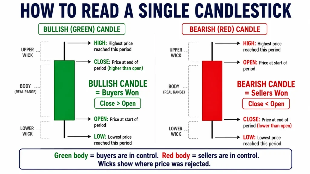
Anatomy of a single candlestick:
The “body” of the candle represents the range between open and close:
- Green (or white) body: Close is higher than open = buyers won this period
- Red (or black) body: Close is lower than open = sellers won this period
The “wicks” (thin lines above and below the body) show the high and low reached during the period.
Why candlesticks are preferred for reading stock market charts: The color coding makes buyer/seller dominance immediately obvious. A glance at a candlestick chart tells you the story of recent sessions without calculating anything.
Understanding Trends: The Foundation of Chart Reading
The single most important concept in reading stock market charts is trend identification. Everything else builds on this.
The Three Trend Directions
Uptrend: Price makes higher highs and higher lows over time. Each peak is higher than the previous peak, and each valley is higher than the previous valley. This is the signature of a healthy bull market or bullish stock.
Downtrend: Price makes lower highs and lower lows. Each peak is lower than before, each valley deeper. This is the signature of a bearish market or weakening stock.
Sideways (Consolidation): Price moves within a horizontal range without making significant new highs or lows. Neither buyers nor sellers are dominant. This often precedes a significant move in either direction.
The trading principle: Trade in the direction of the trend. Don’t try to catch falling knives in a downtrend or short stocks in a strong uptrend. The trend is your friend until it isn’t.
How to Draw Trend Lines
A trend line connects two or more significant price points to visualize the trend direction.
Drawing an uptrend line:
- Find the first significant low point on the chart
- Find the second significant low point (must be higher than the first)
- Connect them with a straight line
- Extend the line forward
Drawing a downtrend line:
- Find the first significant high point
- Find the second significant high point (must be lower than the first)
- Connect them and extend forward
The rule: The more times a trend line is “touched” without breaking, the stronger and more significant that line becomes. A trend line touched 5+ times is a major technical level that the market respects.
Trend line breaks: When price closes decisively above a downtrend line or below an uptrend line, the trend may be reversing. This is one of the most reliable signals in all of technical analysis.
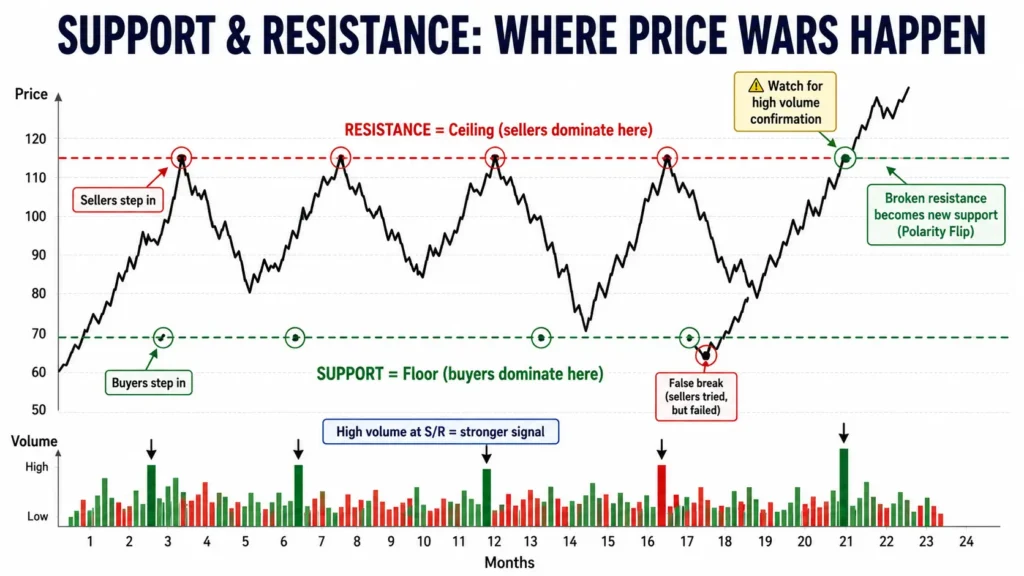
Support and Resistance: Where Price Wars Happen
If trend lines are the direction of travel, support and resistance are the walls and floors that price bounces between.
What is Support?
Support is a price level where buying pressure consistently overcomes selling pressure—where price has bounced upward multiple times in the past.
Think of support as the floor. Sellers push price down, and buyers at that level step in to buy, preventing further decline. The more times price has bounced off a support level, the more significant (and reliable) that level becomes.
Why support works in reading stock market charts: Buyers who missed the previous bounce now place buy orders at that level, anticipating another bounce. This self-fulfilling psychology makes previous support levels active again.
What is Resistance?
Resistance is a price level where selling pressure consistently overcomes buying pressure—where price has reversed downward multiple times.
Think of resistance as the ceiling. Buyers push price up, and sellers at that level step in to sell, preventing further advance. Investors who bought at lower prices sell to lock in profits; investors who bought at the top sell to break even.
The key insight: When price breaks through a resistance level with volume conviction, that broken resistance often becomes the new support. This “polarity flip” is one of the most powerful and reliable phenomena in all of technical analysis.
Key Support/Resistance Levels
Not all S/R levels are equal. The most significant ones include:
- Round numbers ($50, $100, $500): Psychologically significant—traders place orders at round numbers naturally
- 52-week highs and lows: Market-wide awareness creates strong reactions
- Previous major highs and lows: The market has “memory” at these levels
- Moving average levels: Dynamic support/resistance that moves with price
Moving Averages: Dynamic Trend Indicators
Moving averages smooth out price data to show trend direction more clearly, filtering out short-term noise.
Simple Moving Average (SMA)
The Simple Moving Average calculates the average closing price over a specified number of periods. A 20-day SMA adds the last 20 closing prices and divides by 20.
Common moving averages for reading stock market charts:
| 20-day SMA | Short-term | Day traders, swing traders |
| 50-day SMA | Medium-term | Swing traders, investors |
| 100-day SMA | Medium-long | Position traders |
| 200-day SMA | Long-term | Investors, major trend direction |
The golden rule: Price above a moving average = bullish. Price below = bearish. The longer the period, the more significant the signal.
The Golden Cross and Death Cross
Two of the most widely watched signals in all of technical analysis involve the 50-day and 200-day moving averages.
Golden Cross: The 50-day SMA crosses above the 200-day SMA. This signals a potential shift from bearish to bullish trend—often described as a long-term buy signal. Major financial media covers every Golden Cross in the S&P 500.
Death Cross: The 50-day SMA crosses below the 200-day SMA. This signals a potential shift from bullish to bearish trend. A Death Cross in the S&P 500 preceded the 2008-2009 crash, the 2020 COVID crash, and the 2022 bear market.
The caveat: These signals are lagging (they occur after the trend has already changed direction). They confirm trends rather than predict them, which makes them more reliable but less useful for timing precise entries.
Exponential Moving Average
The Exponential Moving Average gives more weight to recent prices, making it more responsive to current price action than the SMA.
The 9-day EMA and 21-day EMA are popular for short-term traders. The 12-day and 26-day EMAs form the foundation of the MACD indicator (covered next).
When to use EMA vs. SMA:
- Fast-moving markets, momentum trading: EMA (more reactive)
- Long-term trend identification: SMA (smoother, less noise)
Essential Technical Indicators
Technical indicators are mathematical calculations applied to price and volume data that generate trading signals. Here are the most important ones for beginners reading stock market charts.
RSI — Relative Strength Index
The RSI measures the speed and magnitude of recent price changes to evaluate overbought or oversold conditions. It oscillates between 0 and 100.
RSI interpretation:
- RSI above 70: Overbought—stock may be due for a pullback
- RSI below 30: Oversold—stock may be due for a bounce
- RSI around 50: Neutral, no clear signal
The crucial nuance: “Overbought” doesn’t mean “will immediately drop.” A strong trending stock can stay overbought (RSI 70-90) for weeks or months. RSI is most useful when it diverges from price.
RSI Divergence: When price makes a new high but RSI makes a lower high, something is wrong with the trend. Buying momentum is weakening even as price appears strong. This is called bearish divergence and is one of the most reliable reversal signals in technical analysis.
Investors using chart analysis to time dividend stock purchases benefit from RSI signals — our guide on dividend investing for passive income shows how to combine both approaches
MACD — Moving Average Convergence Divergence
The MACD compares two EMAs (typically 12-day and 26-day) to generate trend-following signals. It consists of:
- MACD line: The difference between the 12-day EMA and 26-day EMA
- Signal line: A 9-day EMA of the MACD line
- Histogram: The difference between the MACD line and signal line
How to read the MACD:
- MACD line crosses above signal line = bullish signal
- MACD line crosses below signal line = bearish signal
- Histogram above zero = bullish momentum
- Histogram below zero = bearish momentum
Best use: MACD works best in trending markets. In sideways, choppy markets it generates false signals constantly. Check the trend direction first—only take MACD signals that align with the trend.
Volume Weighted Average Price (VWAP)
VWAP is the average price a stock has traded at throughout the day, weighted by volume. It’s one of the most important intraday indicators for professional traders.
Why VWAP matters:
- Institutional investors (mutual funds, hedge funds) use VWAP as a benchmark—they try to buy below VWAP and sell above it
- Price above VWAP = institutional buyers are net positive for the day
- Price below VWAP = institutional sellers are dominating
For day traders, VWAP is essentially the “fair value” line for the trading session. Strong stocks hold above VWAP on pullbacks; weak stocks repeatedly fail to reclaim VWAP.
Chart Patterns: Recognizing the Market’s Repeated Stories
Certain price patterns repeat in stock charts because human psychology repeats. Fear, greed, hope, and panic manifest in predictable visual formations.
Bullish Patterns
Cup and Handle: Price forms a rounded bottom (the cup) followed by a smaller consolidation (the handle), then breaks out higher. A classic continuation pattern in uptrends.
Bull Flag: After a sharp upward move, price consolidates in a tight downward channel (the flag). When price breaks upward out of the flag, the previous trend often resumes with similar magnitude.
Inverse Head and Shoulders: Three lows where the middle low is deepest (the head) and the two outer lows are shallower (the shoulders). A break above the “neckline” connecting the two shoulder highs signals a potential trend reversal from bearish to bullish.
Double Bottom: Price tests a low level twice, fails to break lower both times, then breaks upward. Indicates strong buying interest at that support level.
Bearish Patterns
Head and Shoulders: Three peaks where the middle peak (head) is highest, and two outer peaks (shoulders) are lower. A break below the neckline signals a potential trend reversal from bullish to bearish. One of the most reliable reversal patterns in technical analysis.
Bear Flag: After a sharp downward move, price consolidates in a tight downward channel. When price breaks downward out of the flag, the decline often continues with similar magnitude.
Double Top: Price reaches a high level twice, fails to break higher both times, then breaks downward. Indicates strong selling pressure at that resistance level.
Descending Triangle: Lower highs converging toward a flat support level. Usually breaks downward, indicating sellers are getting more aggressive while buyers hold at the same price.
Neutral Patterns (Direction Dependent on Breakout)
Symmetrical Triangle: Converging trend lines with lower highs and higher lows. Neither buyers nor sellers are winning. The breakout direction (up or down) determines the next move.
Rectangle (Trading Range): Price bounces between a clear horizontal support and resistance level. A breakout in either direction, with volume, signals the next trend.
Wedge: Either rising or falling, price consolidates in a narrowing formation. Rising wedges often break down; falling wedges often break up—counterintuitive but historically reliable.
Candlestick Patterns: Single and Multi-Candle Signals
Individual candlestick shapes and 2-3-candle combinations create powerful short-term signals.
Key Single Candle Patterns
Doji: Open and close prices are nearly identical, creating a cross or plus sign shape. Represents indecision—buyers and sellers were equally matched. A Doji after a strong trend signals potential reversal.
Hammer: Small body with a long lower wick (at least 2x the body length). Appears after a downtrend. The long wick shows sellers pushed price down sharply but buyers rejected those lows completely. Bullish reversal signal.
Shooting Star: Small body with a long upper wick, appearing after an uptrend. Buyers pushed price sharply higher but sellers rejected those highs completely. Bearish reversal signal.
Engulfing Candles: A large candle whose body completely “engulfs” the previous candle’s body. Bullish engulfing (green engulfs red) = buying pressure overwhelming. Bearish engulfing (red engulfs green) = selling pressure overwhelming.
Multi-Candle Patterns
Morning Star: Three-candle pattern at a downtrend bottom. Red candle → small indecision candle → large green candle. The “morning” symbolizes a new bullish day beginning.
Evening Star: Opposite of morning star. Green candle → small indecision candle → large red candle. Appears at uptrend tops, signals potential reversal.
Three White Soldiers: Three consecutive large green candles with higher closes, each opening within the previous body. Very bullish continuation pattern.
Three Black Crows: Three consecutive large red candles with lower closes. Very bearish continuation pattern.
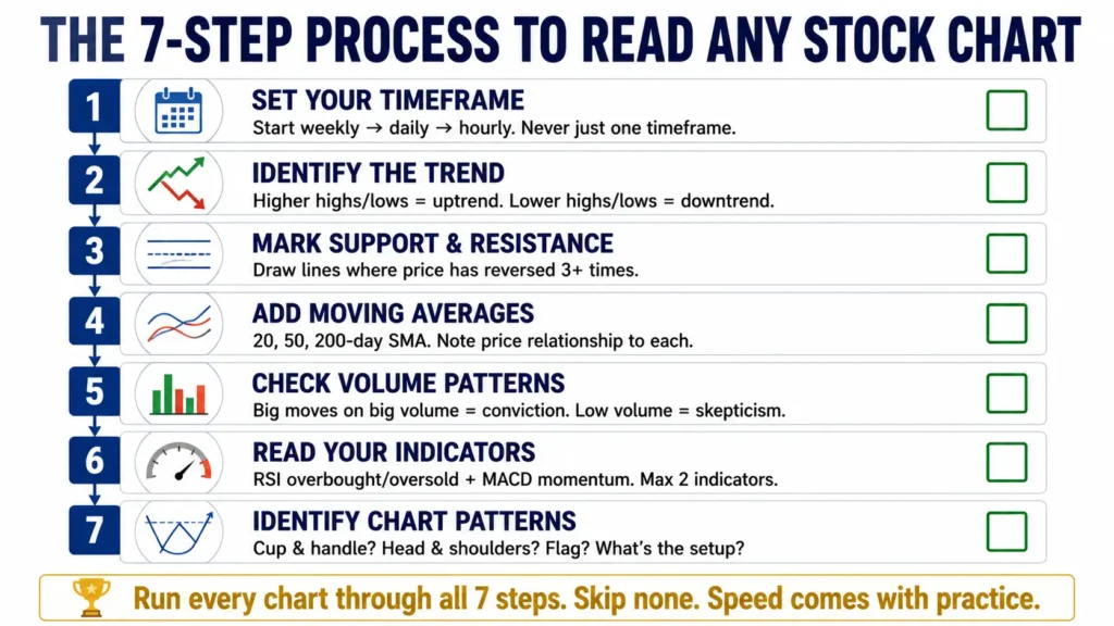
How to Read a Stock Chart Step-by-Step
Now that you understand the components, here’s the systematic process professionals use every time they analyze a stock chart.
Step 1 — Set the Time Frame
Start with the weekly chart for context (long-term trend), then drop to the daily chart for detail, then to the 1-hour chart for entry timing if you’re an active trader.
Never analyze just one timeframe. The weekly might show an uptrend while the daily shows a short-term pullback within that uptrend—the right trade depends on your time horizon.
Step 2 — Identify the Trend
Look at the overall price direction first. Is price making higher highs and higher lows (uptrend)? Lower highs and lower lows (downtrend)? Going sideways (consolidation)?
Draw the appropriate trend line if the trend is clear. This becomes your frame of reference for everything else.
Step 3 — Mark Support and Resistance Levels
Identify major price levels where the stock has reversed multiple times. Mark them with horizontal lines. These become your targets and your stops.
The most valuable S/R levels are:
- Multiple touches (3+ times is significant)
- Levels accompanied by high volume reactions
- Round numbers that correspond to historical reactions
Step 4 — Add Moving Averages
Add the 20-day, 50-day, and 200-day SMAs to your chart. Note:
- Is price above or below each moving average?
- Are the moving averages in the right order for a trend? (20 above 50 above 200 = strong uptrend; 20 below 50 below 200 = strong downtrend)
- Is price using a moving average as dynamic support or resistance?
Step 5 — Check Volume Patterns
Look at whether big moves up are accompanied by above-average volume and big moves down occur on below-average volume (healthy uptrend signature), or the reverse (warning sign).
Look for volume spikes—unusually high volume sessions often mark significant turning points in the stock’s direction.
Step 6 — Add One or Two Indicators
Add RSI to check overbought/oversold conditions and divergences. Add MACD to confirm trend momentum if trend is your primary signal.
Critical rule: Don’t add 8 indicators. They’ll contradict each other and create analysis paralysis. Two well-understood indicators beat ten half-understood ones every time.
Step 7 — Identify Chart Patterns
Look for the patterns discussed earlier—are you seeing a cup and handle forming? A head and shoulders top? A bull flag consolidation?
Pattern recognition improves dramatically with practice. The first few months of chart reading feels like looking at random noise. After 6-12 months of daily practice, patterns start jumping out automatically.
Common Mistakes Beginners Make Reading Stock Charts
Mistake 1 — Confirmation Bias
You decide you want to buy a stock, then look for signals that confirm your decision while ignoring signals that contradict it. The chart becomes a mirror for your opinion rather than an objective source of information.
Prevention: Before analyzing a chart, decide what specific evidence would make you bullish AND what would make you bearish. Then look for both. Let the chart tell you what it says, not what you want to hear.
Mistake 2 — Over-Analyzing
Adding too many indicators until no trade ever looks clean enough to take. Every indicator shows something slightly different, creating paralysis.
Prevention: Pick 2-3 indicators maximum. Master them completely before adding anything else. Most professional traders use fewer tools than beginners, not more.
Mistake 3 — Ignoring Volume
Price moves without volume context are often misleading. A stock breaking out on extremely low volume frequently fails and reverses.
Prevention: Always check volume when analyzing any significant price move. Volume is the lie detector of price action.
Mistake 4 — Treating Patterns as Guarantees
A head and shoulders pattern forms; you short the stock expecting a decline, but price breaks higher instead. Chart patterns have probabilities, not certainties.
Prevention: Every trade based on chart analysis needs a clearly defined stop-loss—a price level where the pattern is invalidated. Risk management is the difference between surviving early mistakes and being wiped out.
Tools for Reading Stock Market Charts
The good news: you don’t need expensive software to read stock market charts effectively. Here are the best free and paid options in 2026.
Free platforms:
- TradingView (free tier): The most popular charting platform globally. Clean interface, most indicators available, active community sharing chart ideas
- Yahoo Finance: Basic but functional for long-term chart analysis and quick checks
- Thinkorswim (TD Ameritrade/Schwab): Professional-grade platform, free with a brokerage account
Paid platforms:
- TradingView Pro: $14.95/month for multiple charts, more indicators, and faster data
- TC2000: $9.98-$29.98/month, powerful screening integrated with charting
- TradeStation: Commission-free trading with institutional-quality charts
For beginners: Start with TradingView’s free tier. It has everything you need to learn how to read stock market charts without spending anything.
Many investment tracking apps now include basic charting tools alongside passive income monitoring — useful for investors doing both simultaneously.
Building Your Chart Reading Practice
Reading stock market charts is a skill that develops with deliberate practice, not passive reading. Here’s the framework that accelerates learning fastest.
Week 1-4: Study one chart type (candlesticks) daily. Find 3 stocks each morning and draw trend lines, identify S/R levels, and add moving averages. Don’t trade. Just observe and record.
Month 2-3: Add RSI to your analysis. Start a “trade journal” where you identify a trade setup, write down why, and track whether it played out as expected. You don’t need to take real trades to learn from this process.
Month 4-6: Start pattern recognition. Each week, find one example of each pattern you’ve learned in a real stock. Screenshot and save them. Build a personal library of examples.
Month 6-12: Combine all elements into a systematic checklist. Trend → S/R → Moving averages → Volume → Indicators → Pattern. Run every potential trade through the checklist before acting.
The honest timeline: Basic chart reading competency takes 3-6 months of daily practice. Pattern recognition becomes instinctive around month 9-12. Real edge development takes 2-3 years. Anyone telling you otherwise is selling something.
Disclaimer: This article is educational content about technical analysis and stock chart reading. It is not investment advice, financial advice, or a recommendation to buy or sell any security. Trading and investing in stocks carry significant risk of loss, including potential total loss of invested capital. Technical analysis does not guarantee future performance. Past chart patterns do not predict future price movements with certainty. Before trading or investing, consult a licensed financial advisor or broker. All tools, platforms, and examples mentioned are for educational purposes only. Trading involves substantial risk and is not appropriate for all investors.
For additional investor protection resources and understanding trading risks, FINRA’s investor education center provides comprehensive guidance on securities trading and protecting your investment portfolio.
Conclusion
Reading stock market charts is not magic and it’s not as intimidating as it looks the first time. It’s a language—one where price bars, volume, and patterns communicate what buyers and sellers are actually doing in real time. Like any language, it requires consistent exposure and practice before fluency develops naturally.
Start with the fundamentals covered here: understand candlestick basics, identify trend direction, mark support and resistance levels, add two or three moving averages, and check volume for every significant move. Practice this systematically on paper before trading real money. The analytical framework you build in the first 6 months pays dividends (literally and figuratively) for the rest of your investing life.
Ready to go deeper? Explore our related guides on understanding volume patterns, which helps dividend investors time entries— dividend income as a passive income job requires knowing when institutional buying is supporting your holdings or check out how to build passive income with real estate if you want to compare equity chart investing with real estate income strategies.
The market rewards patience and preparation. Your chart reading education starts today.
FAQ Section
Q1: How long does it take to learn how to read stock market charts?
A: Basic comprehension (understanding chart types, trends, support/resistance) takes 4-8 weeks of daily study. Reliably recognizing patterns takes 6-12 months. Building a genuine trading edge takes 2-3 years of live market experience. Be skeptical of anyone promising faster timelines—chart reading is a skill that develops through repetition.
Q2: What’s the best chart type for beginners?
A: Candlestick charts are the industry standard and best for beginners who want to progress to real trading. They display the most information (OHLC + color coding) in the most intuitive format. Line charts are simpler but throw away too much useful data. Start with candlesticks from day one.
Q3: Do professional traders use technical analysis or fundamental analysis?
A: Most professional investors use both. Long-term investors (Buffett-style) rely primarily on fundamentals but still consider chart levels for timing. Hedge funds and institutional traders typically integrate both approaches. Pure technical traders exist but represent a minority. The practical answer for most people: use fundamentals to find great companies, charts to find great entry points.
Q4: Can you predict stock prices using charts?
A: No. Charts identify probabilities, not certainties. When a head and shoulders pattern forms, there is perhaps a 60-65% historical probability of a decline—not a guarantee. Professional chart readers don’t predict; they identify high-probability setups and manage risk carefully when wrong. Anyone claiming to predict stock prices using charts is overselling the methodology.
Q5: What’s the most important thing to look at when reading a stock chart?
A: The trend direction, followed immediately by volume. Everything else—indicators, patterns, moving averages—is secondary context. A stock in a strong uptrend on high volume is a fundamentally different situation than the same pattern in a weak downtrend on low volume. Get trend and volume right first; add complexity second.
Q6: What’s the difference between a stock chart and a candlestick chart?
A: “Stock chart” is a general term covering any visual representation of price over time. A candlestick chart is a specific chart type within that category—one of three main types (along with line charts and bar charts). When most people say “stock chart,” they typically mean candlestick charts because that’s the dominant format used by traders and platforms today.

Financial enthusiast with 5 years of experience in the US market trends and personal wealth management